Problem
A well-established 15-year-old construction and interior design company faced challenges with an outdated website that lacked modern aesthetics and sufficient information. The cluttered layout and poor SEO performance affected the company’s online presence, reducing brand visibility and trust. The client sought a complete website revamp that would reflect trust, professionalism, and a modern approach to attract new clients and showcase their industry expertise.
Approach
Understanding the client’s 15-year journey, we worked to incorporate key milestones into the website design, ensuring the content reflected their achievements while preparing for future growth. Similar to how major brands like Mahindra and Kia revamped their logos to match modern expectations, we aimed to give the client’s website a fresh, contemporary look.
Objective
With the client’s three major brand colors—Yellow, Orange, and Cyan—we focused on a visually cohesive design. We gathered key information such as the company’s vision, mission, services, team, and project portfolio to ensure the website communicated the client’s brand identity and expertise.
Our goal was to highlight the company’s metrics, execution methods, and portfolio, emphasizing the importance of showcasing their completed projects and team structure in a clear and engaging way.
Solution
At the initial stage, we presented various design inspirations to align with the client’s preferences. Once the design direction was confirmed, we developed a first draft for feedback and revisions. The website was designed with responsiveness in mind, ensuring seamless user experience across mobile, tablet, and desktop devices.
The final website structure included:
- Home Page
- About Us
- Our Services
- Projects
- Contact Us

Key Features & Challenges
- Brand Story: The client’s unique brand story was highlighted in the “About Us” section, under a heading that showcased the tale of their journey from inception to success.
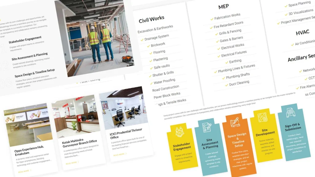
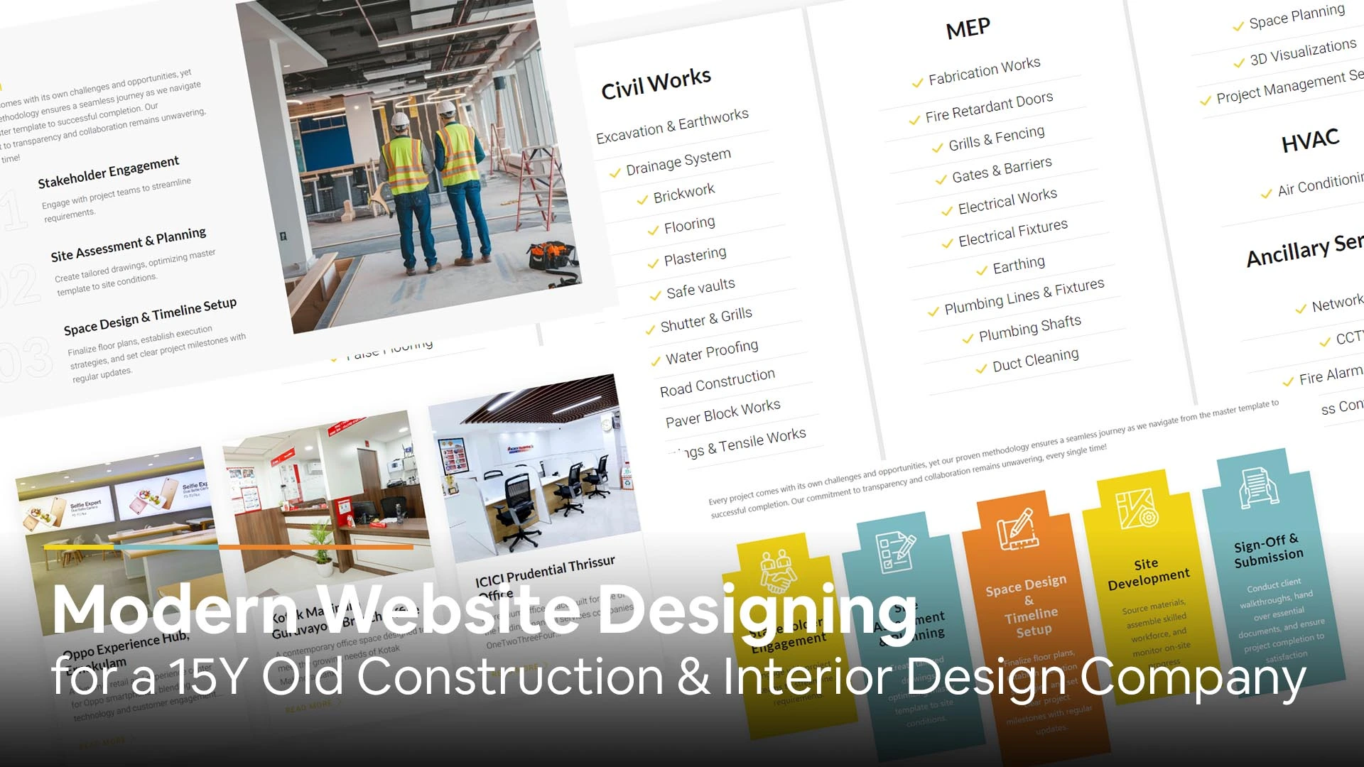
- Execution Plan: A visually engaging section featured the client’s 5-stage project execution plan, demonstrating their unique approach.
- Brand Name Abbreviation: The brand abbreviation was creatively integrated into the design using an image of a corporate meeting room, blending visuals with the business’s core services.
- Team & Stakeholders: A dedicated section showcased the board members, with a team photo highlighting the 50+ member workforce, emphasizing their importance in a project-based industry.
- Metrics & Achievements: To reflect the client’s 15 years in business, we designed a metrics section, showcasing key achievements such as 1,000+ projects completed and 100+ clients served.
- Call-to-Action (CTA): Strategic placement of CTA buttons throughout the website ensures that users can engage with the company at any point during their navigation.
- Footer Design: With brochure downloads and key site links, the footer became an interactive area for users to explore additional resources.
Future Plans
The website was built with scalability in mind. The portfolio section is dynamic, allowing the client to easily add new projects. Additionally, the company plans to expand its content marketing efforts, positioning themselves as thought leaders in the corporate space creation industry.
Conclusion
This web redesign not only revitalized the client’s online presence but also significantly improved SEO performance, trustworthiness, and brand visibility. By combining a modern design with strategic content placement, the website now serves as a powerful tool for business growth, aligning with the client’s future aspirations in the construction and interior design industry.
Here’s the Link to the Project: https://triver.co.in
For more reference to the process of developing a modern website in 2024, please visit here: https://kapreign.com/complete-guide-to-website-development-from-planning-to-post-launch-activities-in-2024/


Leave a Reply